UX Case Study • Fintech
Designing a Scalable
Cross-Border Remittance
Experience
Secure, fast, and scalable remittance from global markets to Ethiopia
My Role
UX/UI Designer
Platform
Mobile App (iOS/Android)
Timeline
8 Weeks
Year
2024
Key Responsibilities
User flow restructuring and optimization
MVP to Design System evolution
Homepage & transfer flow redesign
Project Context
Building a trusted remittance platform for the Ethiopian diaspora and their families
The Problem
The initial MVP was launched quickly to validate market demand. However, it lacked a unified design system, resulting in inconsistent UI components and a fragmented user experience that made scaling difficult.
Target Users
Initial Condition
No unified design system
Fast MVP launch for market validation
Multiple design inconsistencies
Key Challenges
The Challenge
Multiple UX and design system issues were preventing the product from scaling effectively
Inconsistent UI Components
No standardized component library led to visual inconsistencies across screens
Navigation Confusion
Users struggled to understand their current location and next steps
Long Transfer Flow
Heavy and lengthy process created friction and cognitive overload for users
Hard to Scale
Lack of systematic approach made adding new features time-consuming
Weak Visual Hierarchy
Important actions and information were not properly emphasized
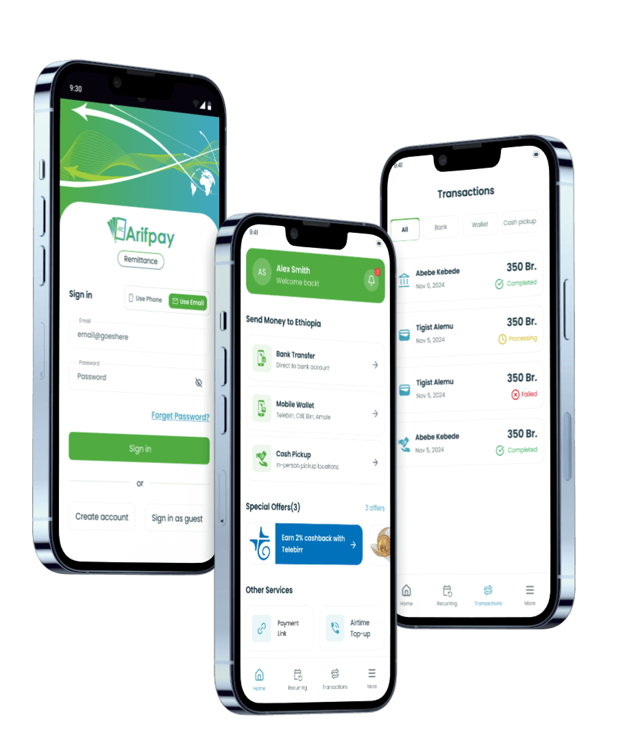
MVP Release
Design Evolution
From MVP to a mature, scalable design system
Iteration 1
MVP Version


Key Issues
Inconsistent spacing and padding
Multiple button styles with no pattern
Heavy cognitive load in transfer flow
Unclear navigation structure
No systematic color usage
Transfer Flow
8+ steps to complete a transfer
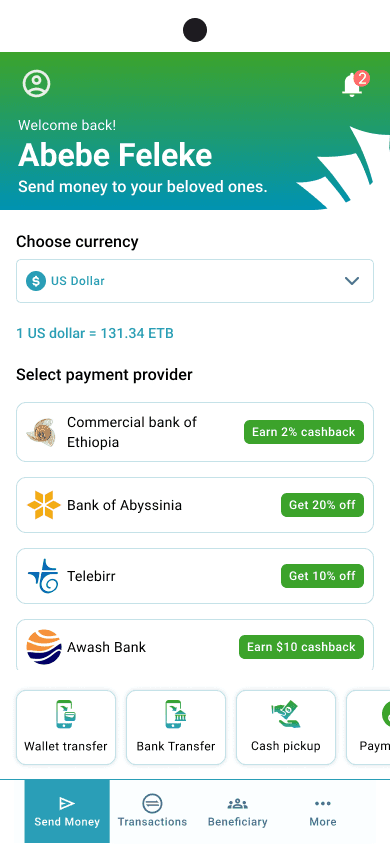
Iteration 2
Design System Integration
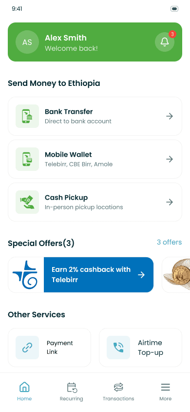


Improvements
Unified design system implementation
Standardized component library
Optimized user flow (reduced steps)
Clear visual hierarchy
Consistent spacing (8px grid)
Improved bottom navigation
Optimized Flow
Reduced to 5 steps with clear progress indicators
UX Improvements
Strategic enhancements focused on usability, trust, and scalability
Reduced Cognitive Load
Simplified transfer flow with clear step-by-step guidance and reduced decision points
Transaction Feedback
Real-time status updates and confirmation screens for peace of mind
Clear Progress Indicators
Visual feedback at every stage so users always know where they are in the process
Standardized Components
Consistent buttons, inputs, and UI elements across all screens
Strong Primary CTA
"Send Money" button prominently placed with clear visual hierarchy
Trust Indicators
Security badges, encryption messaging, and regulatory compliance displays
+28%
Faster Task Completion
Users complete transfers significantly quicker
100%
Component Standardization
All UI elements follow design system
-35%
Reduced Cognitive Load
Simplified flows decreased mental effort
Enhanced
Brand Cohesion
Consistent experience across all touchpoints
Additional Achievements
Scalable Architecture
Design system enables rapid feature development